
GRAPHIC DESIGN · 03/05
VOID
A precision-engineered identity for a performance-wear system built on control, focus and relentless forward motion.

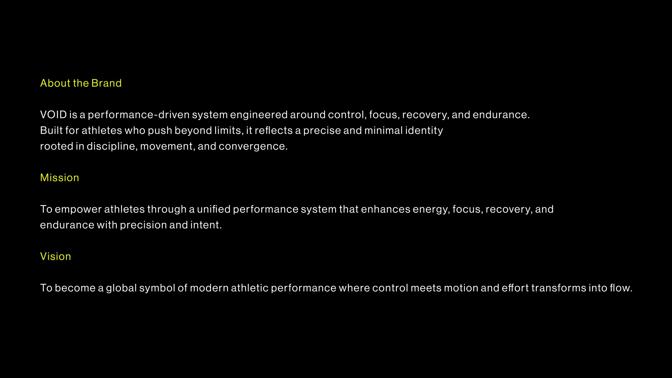
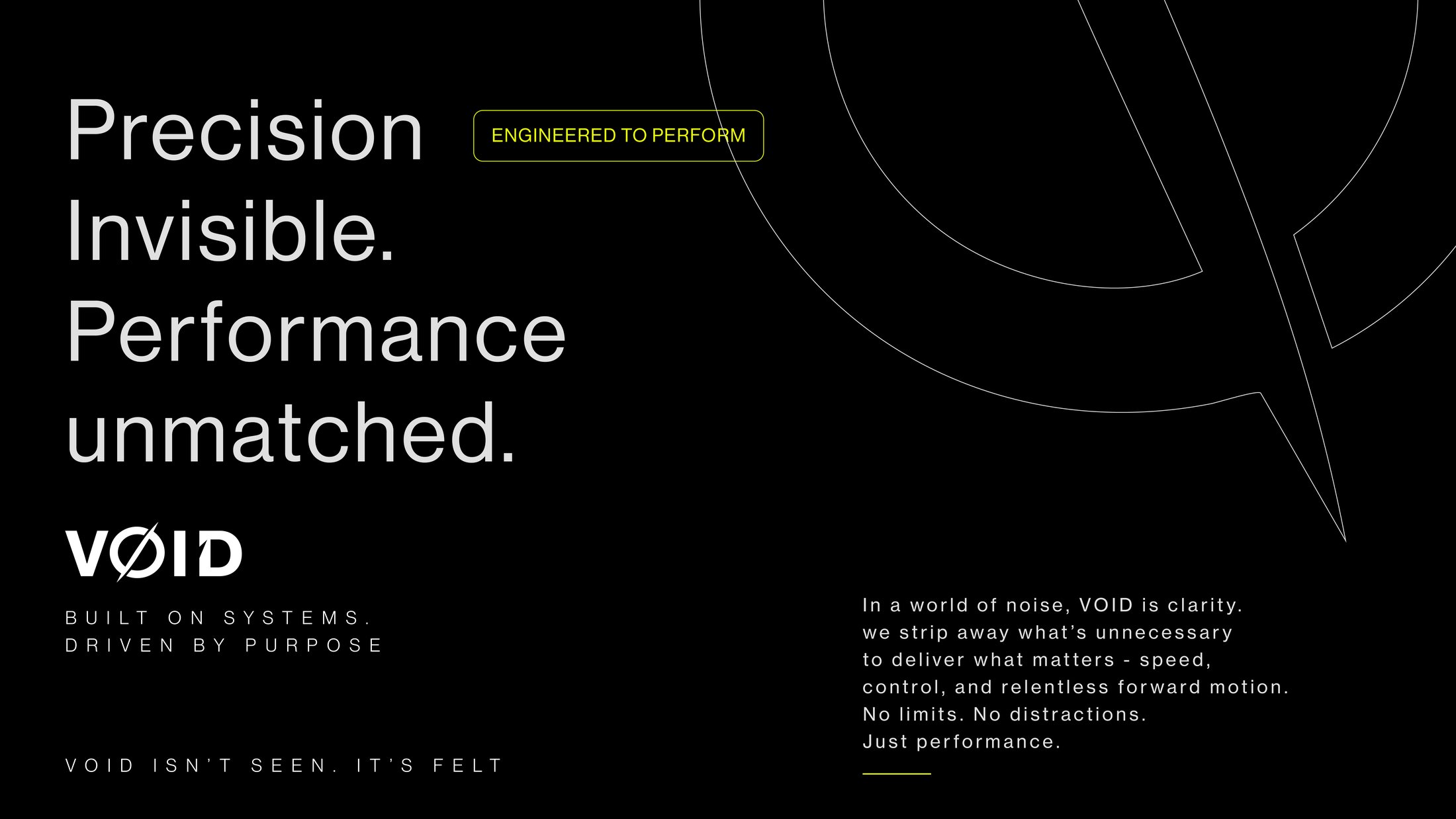
VOID needed an identity that spoke to athletes who push beyond limits — not through noise, but through precision. The brand had to feel engineered, not decorated.
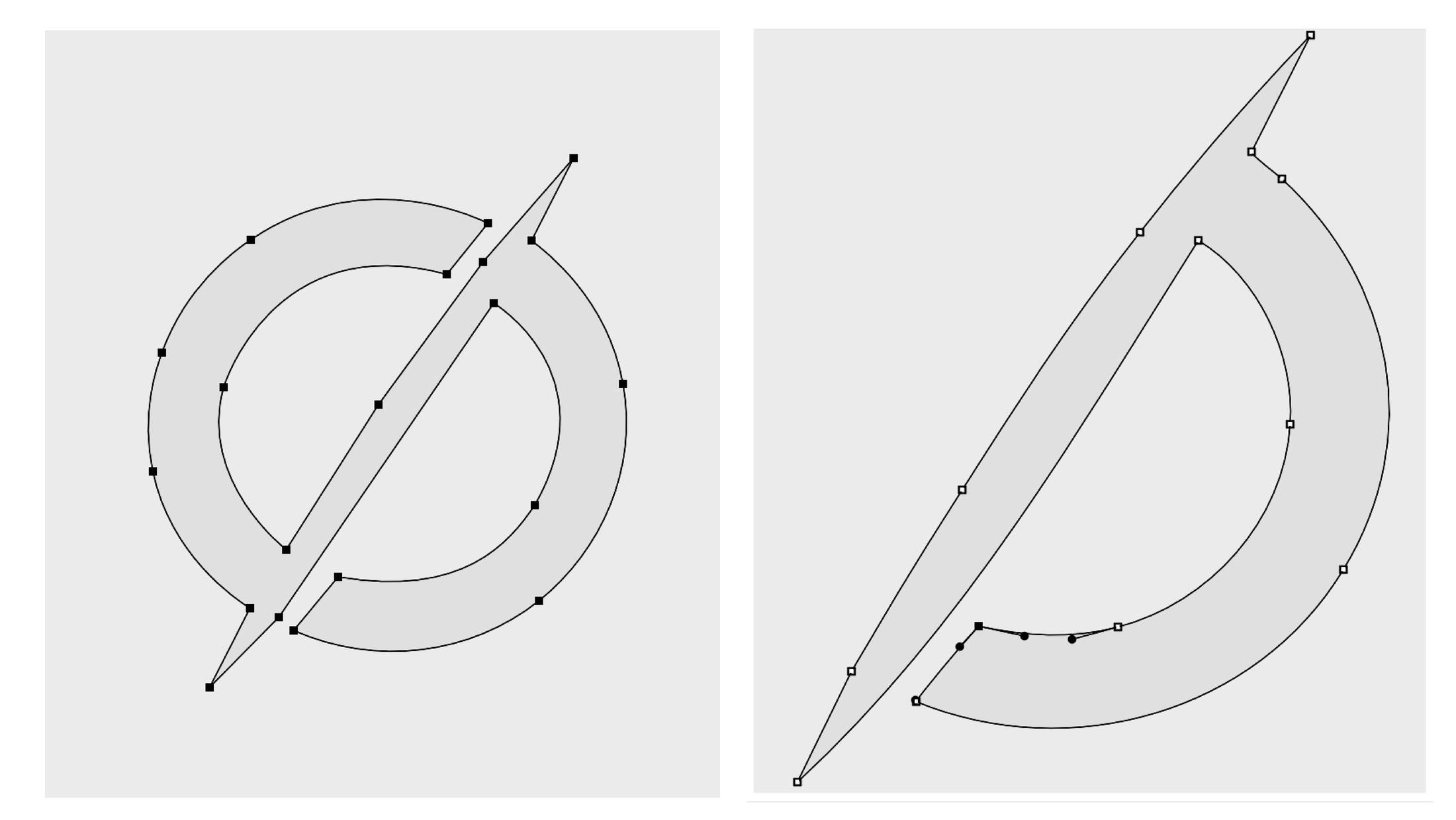
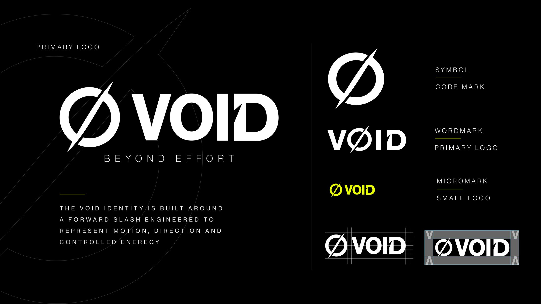
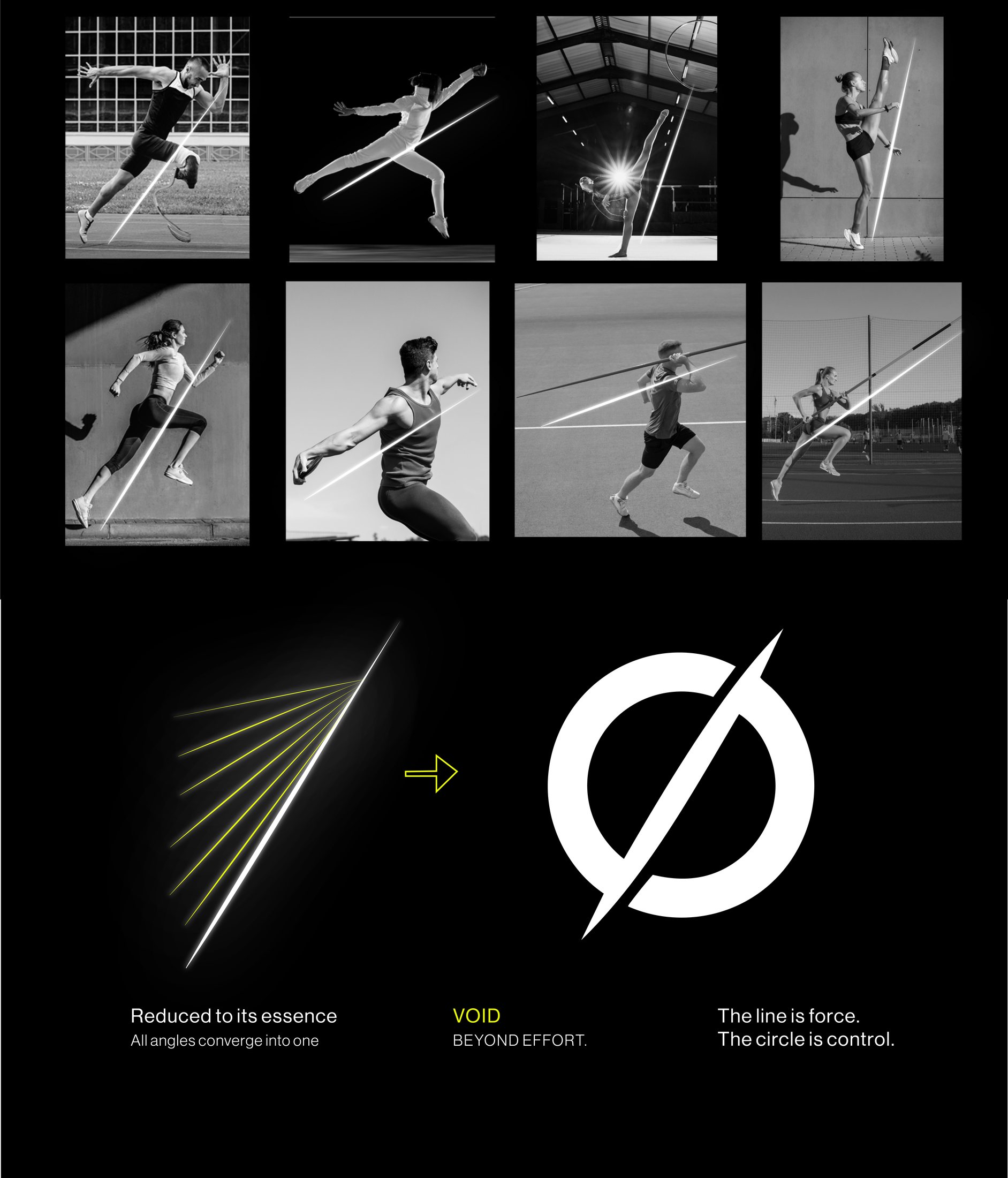
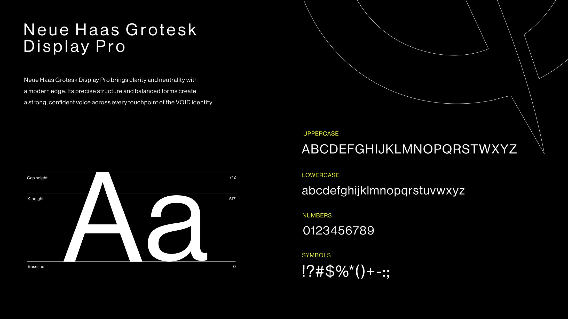
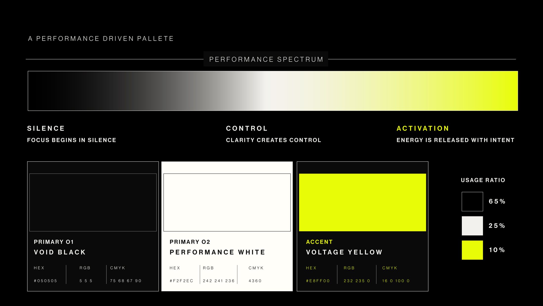
The mark is built around a forward slash — a symbol of motion, direction and controlled energy — paired with a squared-off wordmark and a single acid-yellow accent against near-black. Every touchpoint, from transit takeovers to product tags, was built to whisper rather than shout.



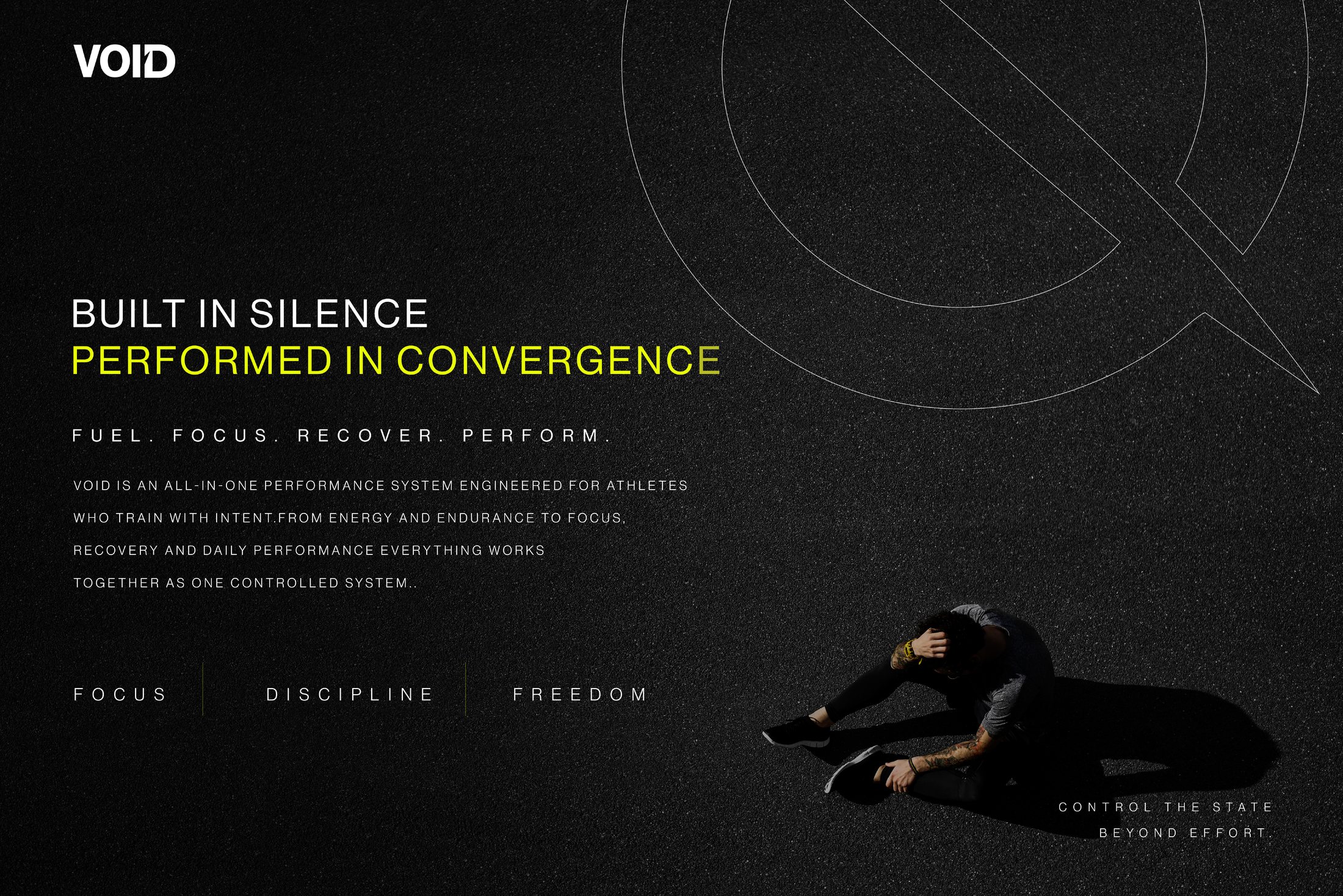
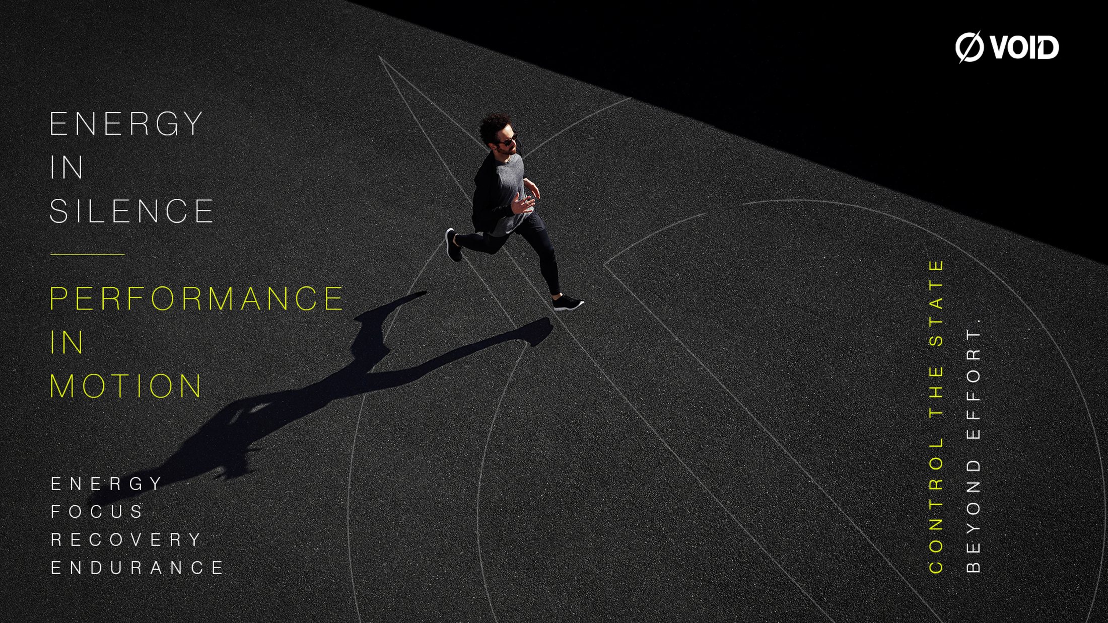
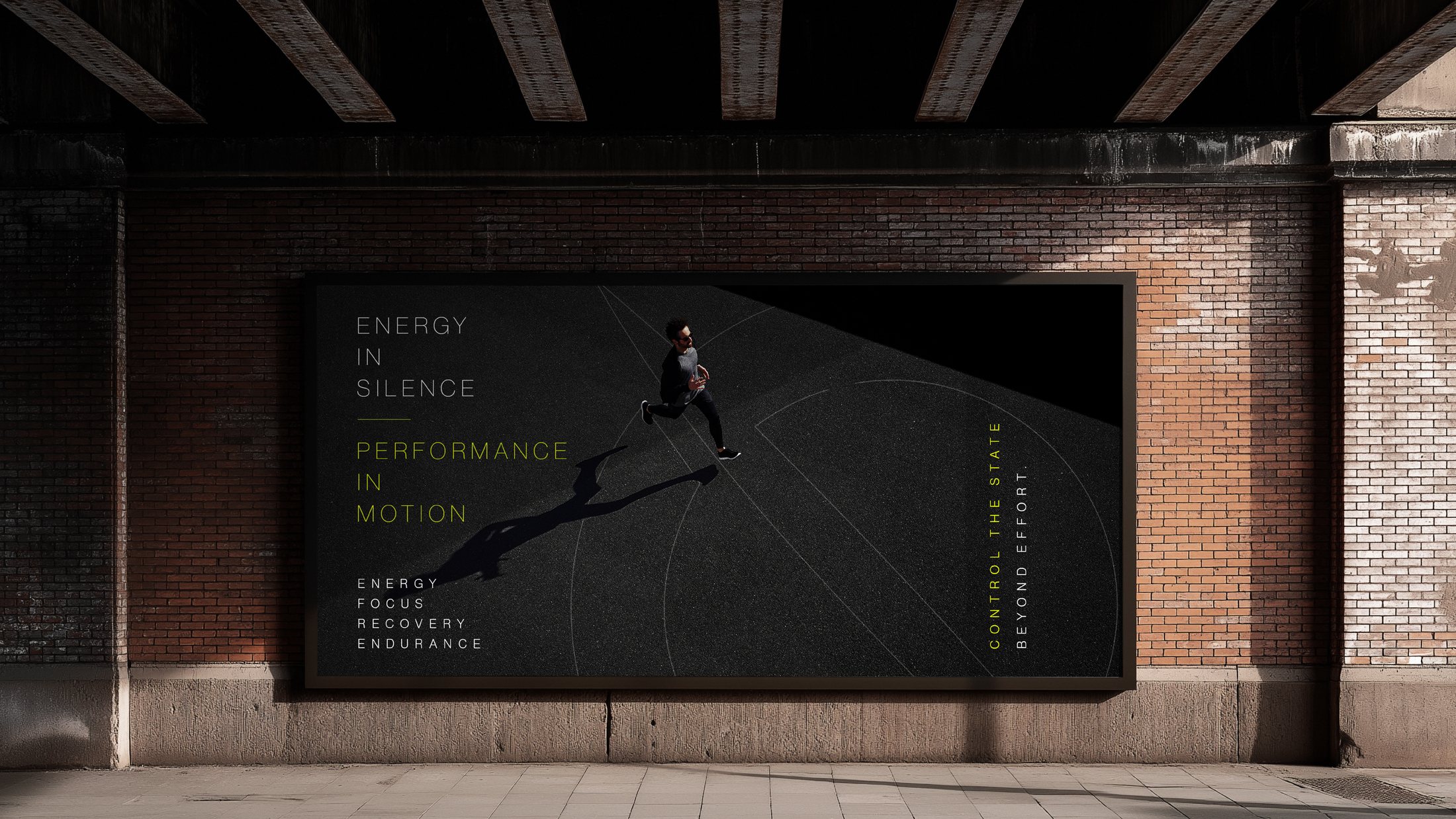
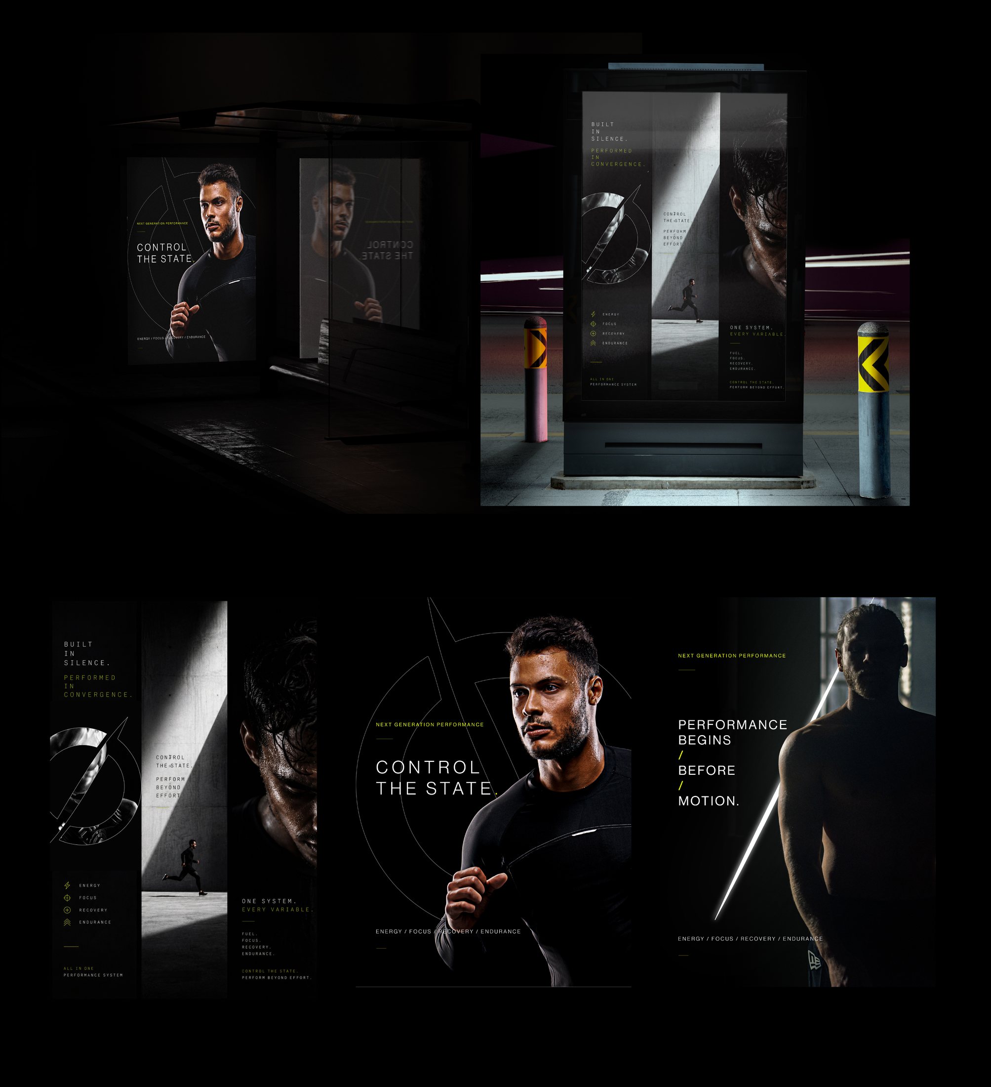







A performance system where restraint becomes the loudest statement: “VOID isn't seen. It's felt.”